Allowing people who visit your website to find their way around it quickly and effortlessly is important for several reasons. Most notably, it will allow you to create a pleasant user experience. This can then result in users spending more time on your website, which is sure to be picked up by Google and thus help you improve your rating on that search engine. This then leads to more organic traffic, which leads to higher revenues, etc. A snowball effect!
But what can you do to improve your site’s navigation, exactly? Well, there are several quick and easy steps you can take that will make quite an impact. Allow us to show them to you!
-
Introduce sticky elements
Do you know how some parts of a page sometimes stay with you no matter how much you scroll? Well, these are called sticky elements and can be incredibly helpful to someone who is not very familiar with your site yet. Imagine you have a long blog post about something, and after they finish reading it, people may want to find what else you have to say and/or offer. Instead of scrolling all the way back to the top of the page, they can immediately click on the sticky menu that’s been following them around and be on their way.
Creating a sticky header or a sticky menu can actually help you bring your bounce rate down because it always gives the visitor the option of navigating away from the page they’re on quickly.
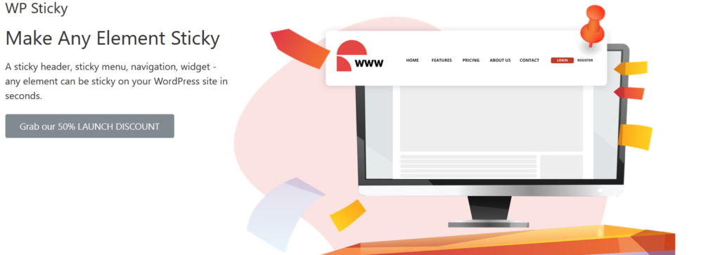
And you really don’t need a lot to make these elements a part of your website. Not even coding knowledge is required if you have the right tools! And the very best tool for the job is WP Sticky, a plugin that is efficient and simple to use but able to make quite an impact on the way your visitors perceive your site.
With this neat little plugin, you can make a sticky header, or basically any part of your website sticky in only a few clicks, plus you can customize them quite a lot to help them achieve the desired effect. For example, you can choose whether they appear at the top of the screen or at the bottom, how opaque or transparent they are, you can change their background color, determine how far they are from the edge of the screen, and to so much more.
And these are just the basic options we’re talking about! So, just go ahead and get yourself this incredibly useful plugin, and a sea of opportunities will open up in front of you.
-
Be accurate
No matter what people are clicking on, your website should always give them at least some idea of what they can expect on the page they are about to open. This goes for your navigation system as a whole and for links that are inserted into the content of the page. Even if the link is in an image, the same rule should still apply.
Remember, people are usually browsing websites because they are looking for something particular in mind. On top of that, internet users are not really famous for their patience. Therefore, if they find your website hard to traverse, they are likely to leave and probably won’t return any time soon. Reduce your bounce rate by showing them exactly where they can find the desired information and how they can get to it.
-
Have a search feature? Make sure it works!
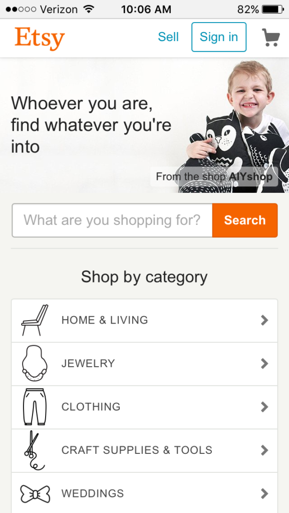
Providing your visitors with the ability to just type what they’re looking for and then clicking “Search” can be a great way to help them browse your content, especially if you have a lot of it. But it can also be a huge inconvenience if it doesn’t work properly. This is especially important if you’re running an online shop, and you might want to put this feature somewhere at the top of the page so that the user can search right away.
The search results displayed always have to be relevant, and they have to take into account potential spelling errors the user can make. And if you don’t have exactly what somebody types in, show them the next best thing, show them something closely related to what they’re looking for. If your search feature after a query for an item shows just “no product found”, this can be a huge blow for you because it will leave the visitor at a loss concerning where to look next. The likely outcome of this situation is that they will leave.
-
Think of mobile users
More than one-half of all online traffic comes from mobile devices these days, so you absolutely MUST be careful how your website will look on those smaller screens and make sure that you rock the mobile-optimized web design. Consequently, you also have to think about making your website easy to navigate for those users.
Expandable mobile menus are the best solution for this, and they are pretty much a standard nowadays. Otherwise, the user may have difficulty reading the menu and getting to the page they’re interested in. Fortunately, most good WordPress themes already have this feature in them, so you won’t have to worry about it too much.
However, if you’re designing your own website and are starting from scratch, this is certainly something to look out for.
-
Include ALT text in your images
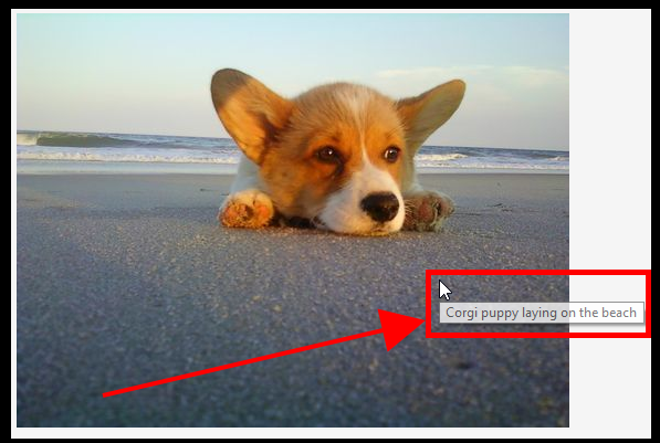
As we said, images can also be links, but it needs to be absolutely clear that this is the case. Using the ALT attribute to show what people can expect to find on the other side of the link is the way to do this. You need to be accurate, remember?
However, there are some other benefits to doing this. It will help with your SEO a bit because it will tell Google more about your site, and visually impaired people will be able to use your website much more easily. Certainly, making your pages accessible to a wider audience can’t hurt your website’s overall performance. Quite the contrary!


You can also stay updated by subscribing to iTechCode.