It seems that every year there are new website design trends that emerge which shape the look and feel of every website which proceed them.
In recent years some of the most notable web design trends include HTML5-powered responsive web design and the use of flat user interface controls; a departure from the skeuomorph mimicry of real world objects which had become so popular with previous Apple operating systems in addition to fly-out menus, greater use of white space, and larger “hero” images giving websites that magazine sheen.

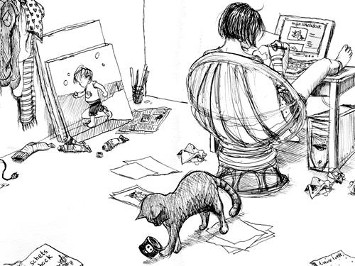
Image by lotje via Flickr
In 2016 these trends continue to evolve and we are also beginning to see new ones surface. The purpose of this article is to highlight some of the more striking 2016 web design trends to provide our readers with a little inspiration. If you’ve got anything to add, let us know in the comments as we’d love to hear from you.
2016 Web Design Trends
- User Interface Elements
The evolution of responsive design, popularity of WordPress, and the mobile-friendly requirements placed on webmasters by Google have all conspired to make many websites have a similar look and feel.
Breaking it down, when everyone hops on a bandwagon, things start to look similar. However fret not fellow web designers as these particular elements have been working toward the betterment of the web and have potential to enhance a creative website design. Don’t believe me? Just take a look at the Quikclicks web design portfolio.
The move toward UI influenced design has only just begun, and in 2016 were going to see more website redesigns which implement attributes that make a website feel more like a software application.
The benefits of UI-inspired design: common elements like FontAwesome icons, less images, and more CSS wizardry which translate into faster loading times and faster browsing because common design principles are universally understood.
- Card Layouts
When it comes to influencing web design trends for 2016, Apple isn’t the only behemoth influencing how we design web pages. Microsoft went all in with card layouts in recent years, and no matter what you think of the last two iterations of Windows, card layouts have come to the web in a big way.
Building upon the striking visual strengths of Pinterest’s tiled page layouts and WordPress’ masonry blog post displays, card layouts are popular in responsive design because of their ability to serve as individual dynamic content containers while being able to rearrange on their own to conform to the break points of just about any screen size.
- Custom Loading Animations
The spinning wheel, once abhorred by Windows users in the late nineties and early 2000’s made a serious comeback with rich media in recent years –however that trend seems to have been quashed once again through the use of custom loading animations.
The most common form of custom loading animation has been a play on the website’s company logo, with Slack being a prime example.
- Hidden Navigation
To compensate for smaller screen sizes on mobile devices, many websites have dropped their floating full menu in favour of the infamous floating square with three lines on it which floats in one of the top corners of a website visitor’s screen.
Once clicked, a full menu is given focus on the page and often the page underneath is greyed out, which is taking a page from “material design”; our next point on this list.
This trend has become so universally accepted and understood that many desktop websites are beginning to implement it once a website visitor has scrolled below the fold.
- Material Design
While flat design is in and skeumorphs are out, three dimensional website interfaces are not dead.
Through the use of layers, companies such as Google, PayPal, Angular, Evernote and others have created landing pages that emphasise the clean yet clever use of background, middle ground, and foreground content or images.
Other websites like the soon-to-be-defunct getbeagle dot co (a web-based proposal writing software by Citrix) really pushed the envelope by animating elements of each of these layers for an incredibly subversive web browsing experience. On last check the website was still up, so you might want to check it out.
In Conclusion
We have only just begun to scrape the surface of popular website design trends in 2016; we didn’t even mention how common it is becoming for websites to use social sign-in, vibrant colour schemes, longer shadows that add depth and dimension, simple typography, ghost buttons which don’t distract, hover animations, slideshows, or responsive design that works in tandem with server-side computations (RESS) for faster website loading.
The dust is far from settling on 2016 web design trends and we’d like to hear from you to learn more about what you think will be popular this year. Have anything to add? Why not let us know in the comments?
You can also stay updated by subscribing to iTechCode.